RUNLAND — turning every run into a game you play with friends

RUNLAND is a running game I planned, designed and shipped to beta on my own: every km you run becomes land on a city map, and friends battle for it each week.
RoleSolo product designer: research, product strategy, game rules, UX and UI, design system, motion, AI-assisted build
TimelineOctober 2026 to now
StatusBeta,  iOS and Android
PlatformiPhone, Android 
ToolsFigma, FigJam, Claude, Claude Code, Expo, Supabase
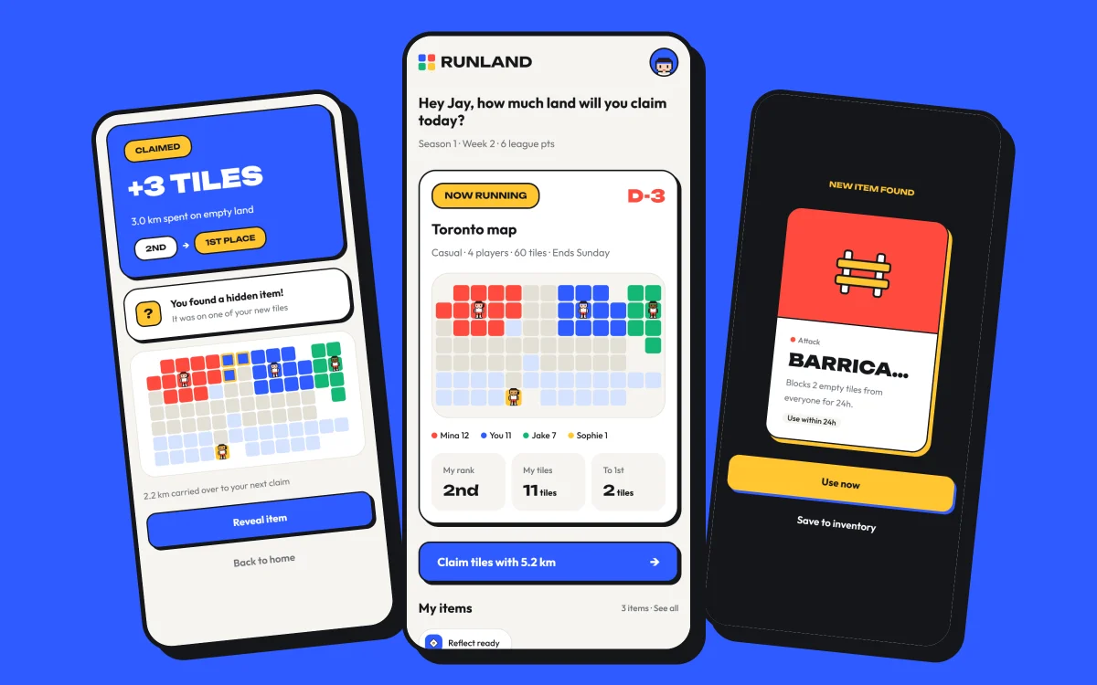
Hero: Home v2 with pixel runners on the Toronto map, next to the Claim result and an item card
01
problem

For most runners, the fun of a run ends the moment they post it

Running apps are built around personal records, so motivation fades between runs.

Other running territory games that use real GPS routes add play, but they are unfair by design: city runners win, friends in different cities can't compete, and treadmill runs don't count.

How might we keep the fun of a run going all week, with friends, for runners of any pace, wherever they live?
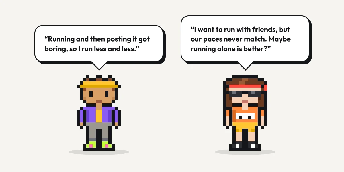
The problem
02
principles

Principles I designed against

Any pace, any place.The map is a virtual city, so where you run never decides who wins.
Strategy beats volume.Running more helps, but choosing where to expand, when to steal and when to defend decides the week.
Friends first.Small invite-only rooms, not a global leaderboard.
Fair to the end.Nothing that changes the score is for sale.
03
concept

Your run is the currency

1 km claims one empty tile on a shared city map, and a room of 2 to maximum 10 friends competes for the most land each week.
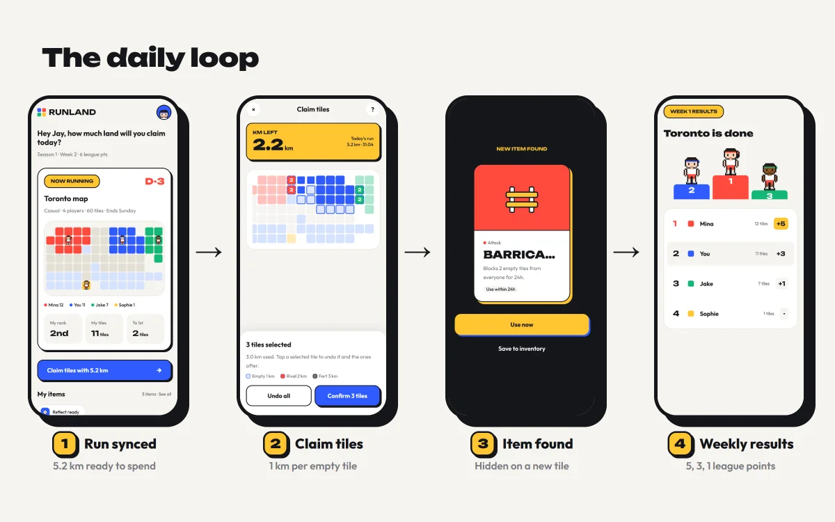
1. RunAny run saved to Apple Health or Health Connect counts, outdoors or on a treadmill.
2. ClaimSpend the km by tapping tiles next to your land. Empty tiles cost 1 km, a rival's 2 km, a fortified tile 3 km.
3. Play itemsHidden tiles and 3-day streaks drop 13 items in three kinds: attack, defense and buff.
4. Win the weekMost tiles at Sunday midnight wins. Places earn 5, 3 and 1 league points.
5. Win the seasonFour weeks, a new city each week, one champion and a medal.
Core loop strip: run synced, claim tiles, item found, weekly results
04
flows

Flows and structure

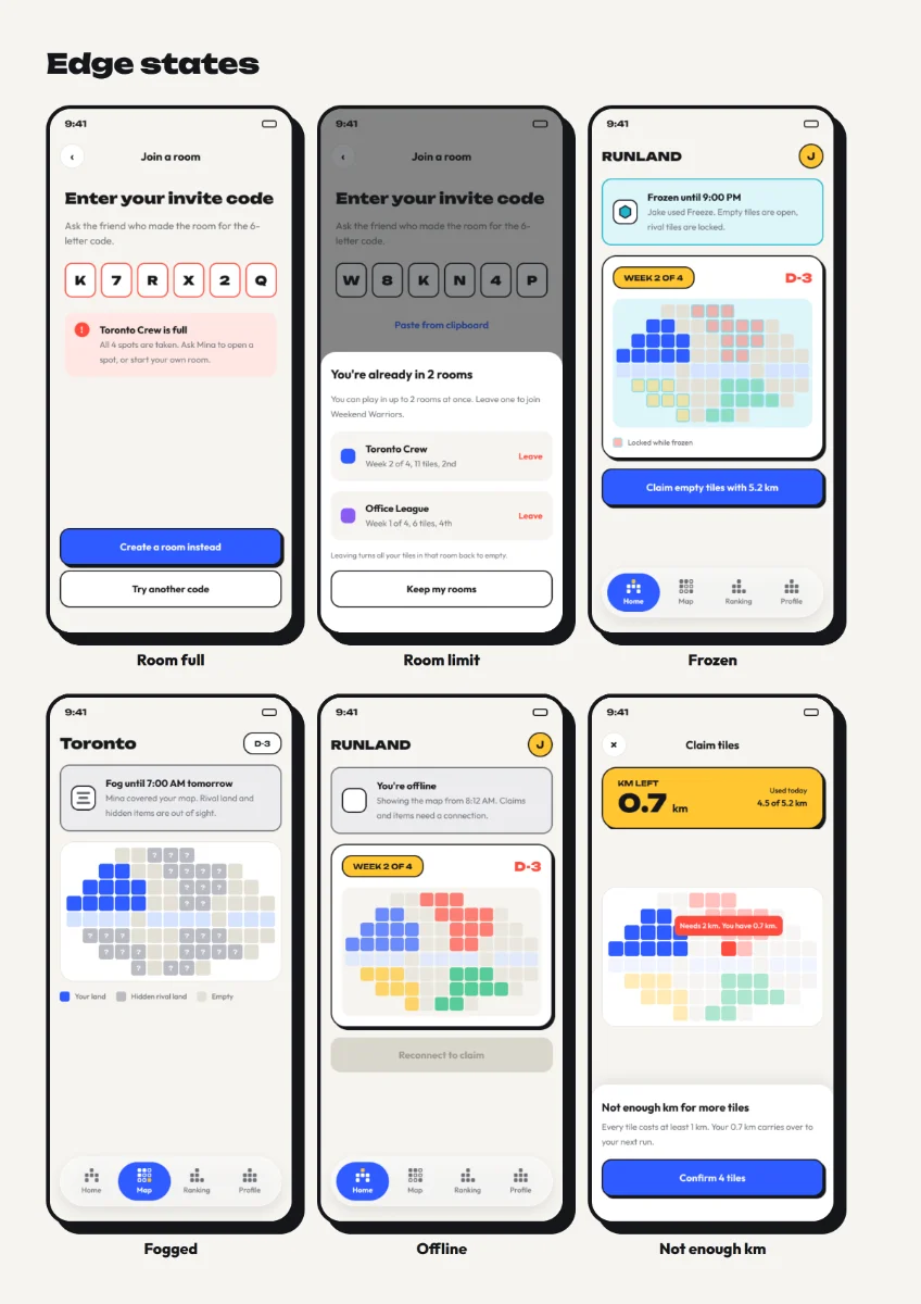
I mapped three flows in FigJam before drawing screens, then designed about 40 screens across them, including empty, error and edge states.
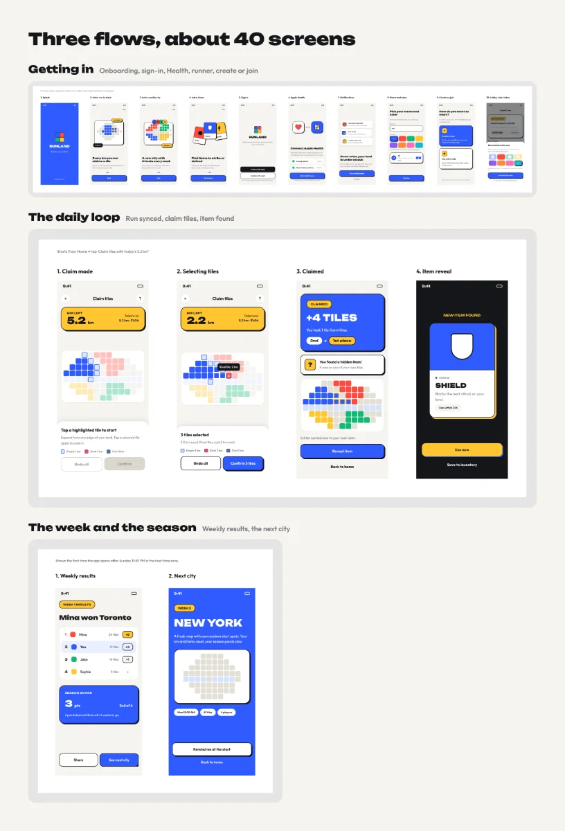
Getting inOnboarding, sign-in, Health permission, making your runner, then creating or joining a room.
The daily loopRun synced, claim tiles, item found, use an item, overnight results.
The week and the seasonWeekly results, the next city, season champion, inactive players and leaving a room.
The three FigJam flows
Edge states grid
05
visual direction

A clean base with Memphis moments

I wanted RUNLAND to look like a game you play with friends, not another running tracker in black and neon.
Why not full MemphisMy first idea was bold patterns everywhere. On a 350-tile map that made it hard to tell whose land was whose, so I kept the map flat and readable.
Memphis only for rewardsFlat primary colors, 2px ink outlines and hard offset shadows appear only on the moments that should feel good: the map card, item cards, claim results, weekly and season wins.
Blocks as the brand languageThe nav icons are built from the same 6px blocks as the map tiles, and the logo is four tiles.
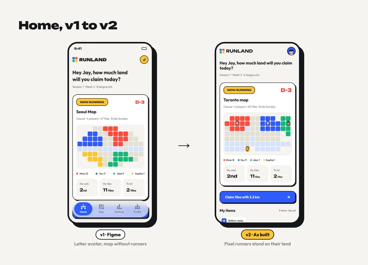
A pixel runner as youIn development the letter avatars became a 16×24 pixel runner you dress up, which made the map feel alive and opened a fair way to earn: cosmetics, not power.
Visual direction: v1 vs v2 home and the 13 item cards
06
design system

Tokens first, so design and code share the same source

I built a small system with one rule behind it.

PartWhat it holds
Color9 core colors, 8 player colors, 3 item category colors, status tints for frozen, fog and offline
TypeUnbounded for headlines and numbers, Outfit for everything else, 13 text styles
Space and shape8pt spacing, 16 side margin, radius scale from 4 to 40
ElevationHard Memphis shadow, soft shadow, sheet shadow
ComponentsButtons, chips, cards, banners, sheets, code input, map tiles in 14 states, item cards, block nav icons, glass tab bar

The same rules live in a design system doc and a theme file in the codebase, so screens built in code match Figma.
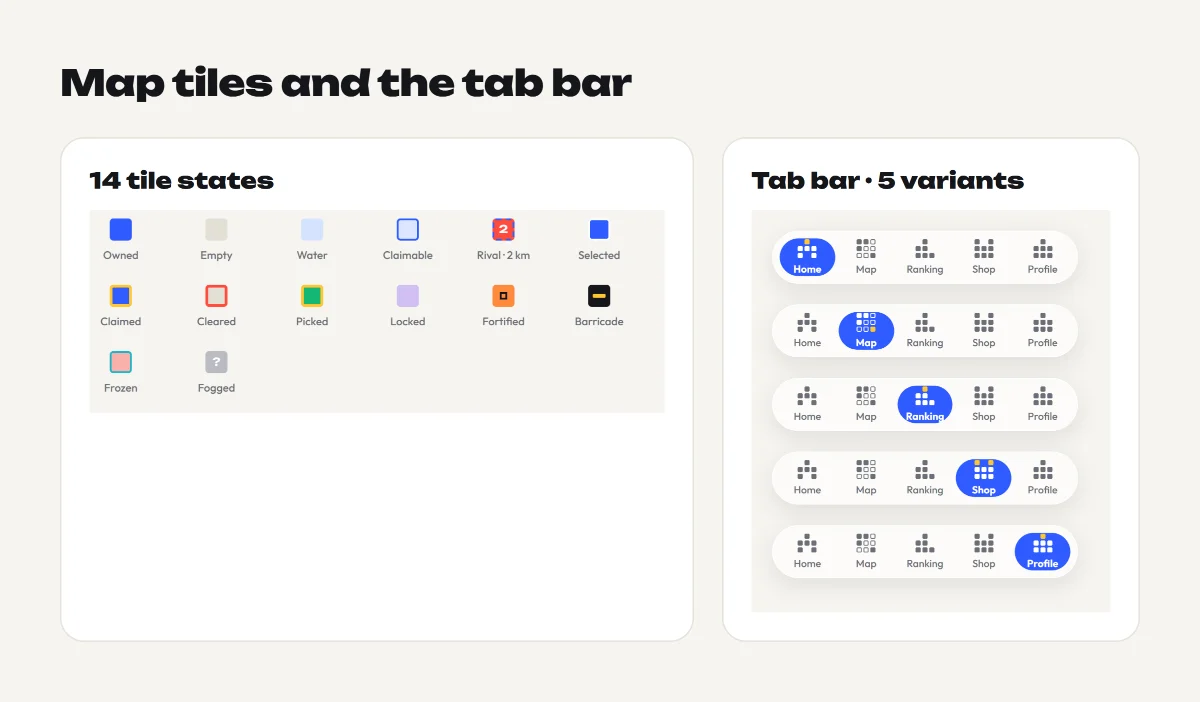
Tile state sheet and the Tab Bar component with its five variants
07
build

From design to a working app

I'm a designer, not an engineer, so I used AI as my build partner and kept every product and design decision myself.

1. Prove the rules firstBefore any app code, I built a playable web prototype with practice rivals to tune map size, steal costs and item strength.
2. Hand off like a team wouldI wrote the planning doc, the design system and a short brief for Claude Code, plus a theme file of tokens.
3. Build in small stepsClaude Code built the Expo app one stage at a time: components, game logic, screens, backend, Health sync, push.
4. Bring code back to FigmaI moved the coded UI back into Figma as v2, so the design file reflects what ships.

What changed between v1 and v2

Areav1 in Figmav2 as built
AvatarsLetter in a colored circlePixel runner you customize
TabsHome, Map, Ranking, ProfileAdds Shop for cosmetics
Rooms4, 6 or 8 players2 to 10 players
Sign-inApple, emailApple, Google, email code
RewardsPoints onlyCity medals and a season medal
08
beta testing

About 20 testers, playing real weeks

Testers on iOS and Android are playing real weeks with their own runs. I recruited them through running and indie dev communities on Threads and TikTok.

What I'm measuring, and what each answer would change

QuestionHow I measure itResult
Do rooms fill?Time from room created to all spots joinedNot an issue. A room can start before every spot is taken, so waiting for a full room never held a game back.
Do people finish a week?Share of players still running on SundayIn progress
Is the map fair?Gap between 1st and last place, by difficultyIn progress
Do items matter?Items used per player per week, comebacks after an attackIn progress
Where do people get stuck?Drop-off in onboarding, support messagesItems. Players can’t see what an item does until they find one, so many didn’t understand items at first.

What I've changed from feedback so far

Indicator shown when activating an activatable item
Allow starting the game with current players even if the room isn't full
Remove color selection during onboarding after adding pixel characters
09
launch

Launch and what I learned

I'm launching invite-first: rooms are made for friends, so each new player brings a few more. I also design the launch content myself, from the intro animation to TikTok and Instagram posts that show a run turning into land.
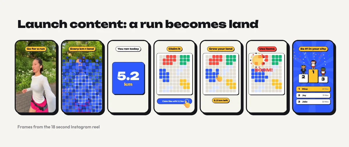
Launch content frames

What I learned

Rules are design.Most of my time went into costs, timers and edge cases, not screens. Small numbers like 2 km vs 3 km decided whether the game felt fair.
Prototype the system, not just the screens.The playable web prototype caught balance problems that no static mock would show.
AI speeds up building, not deciding.It wrote the code fast; knowing what to build and why stayed my job.

Next

→ Finish the beta and fill in the results above → App Store and Google Play launch → Gather more feedback to find what to improve next