SoftMoc — rethinking the entry point
Rethinking entry points for a 30-brand footwear catalogue
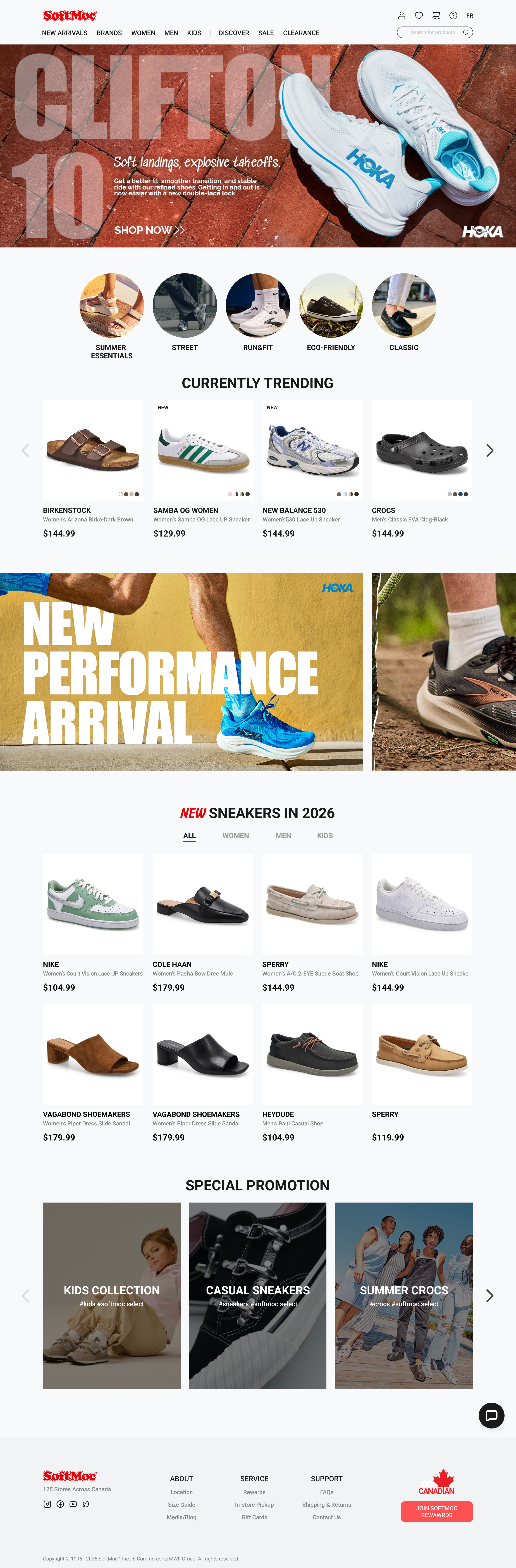
Entry points that go somewhere new
How might we give the homepage an entry point the navigation can't already reach?
Five entry points, all of them sub-items of the top navigation. They also sorted by four different logics at once: product type, gender, age, and use case. Reaching slides took four levels, and brands never met on the same screen.
One axis: what you're shopping for
Navigation classifies. The homepage curates.
Scope: entry points only. Room landing pages are defined by rule, not designed.
All five entry points were already sub-items of the top navigation — a narrower path to somewhere one hover away. Reaching slides took four levels, and brands never met on the same screen.
One step. A curated bundle that cuts across brand and product type — which is exactly why it can't live in the navigation tree.
Colour lives in the products
The interface runs on neutrals plus one red.
The brand palette was fixed. The problem wasn't the colours but where they came from. Any campaign could introduce its own, so no colour ended up owning a meaning. The yellow came from a Nike tile, the purple from category labels, the blue-to-orange from a discount template.
Four states
Card heights hold no matter what the data does.
Swatches cap at four with a plus-count, names truncate at two lines, and sale price stays black. Red belongs to the badge.
Built for a heavy promo calendar
Promotions get a slot system rather than a single section.
Retail homepages carry promotions in bursts: a sitewide campaign, several brand deals, a seasonal push, often all in the same week. One sitewide bar, two brand slots between product rows, three category cards at the foot. Past two, the brand slots become a carousel instead of stacking, so the page length stays predictable no matter how heavy the calendar gets.