Tamp — turning occasions into gifts
Calendar sync and gift discovery
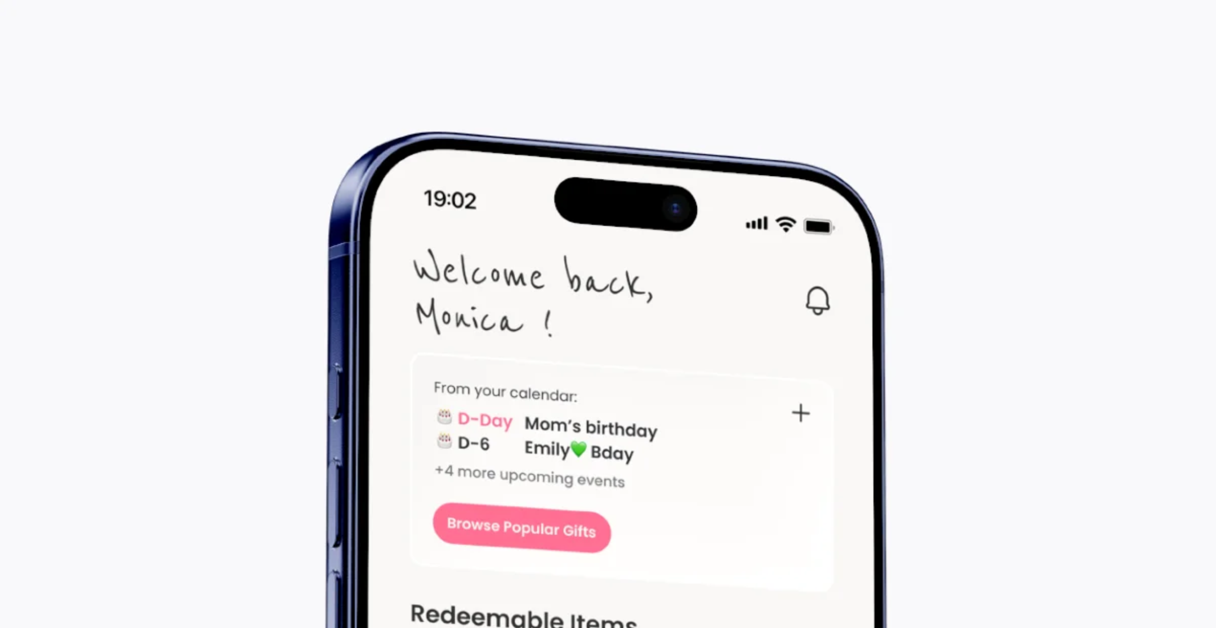
Remembering isn't the hard part. Deciding is.
How might we turn a date someone already knows into a gift they actually send?
People know the date is coming. What stalls them is “what do I send?” and that's where the occasion gets lost.
One loop, two ways in
Tamp has two sides: someone sends a gift, someone redeems it at a local café. I designed both, end to end, across five tabs.
Today a gift starts one of two ways. Most routes start from a place, like a new café or a store nearby, and find something inside it. The calendar starts from a person and skips the store entirely. It was the last of the two to arrive, and it's the one this case study zooms into.

Occasions live in the wrong place
People track birthdays across calendars, chat threads and memory. None of those sit anywhere near a place to act.
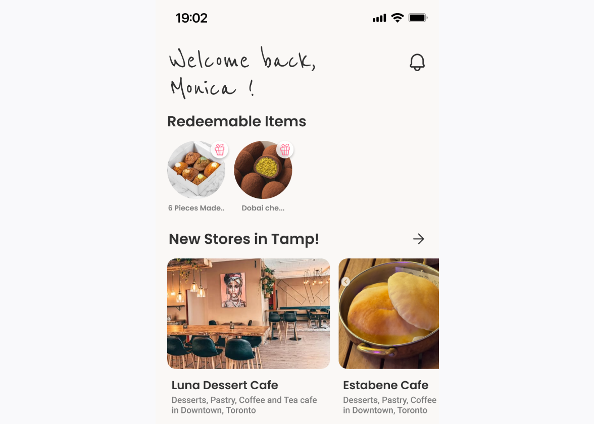
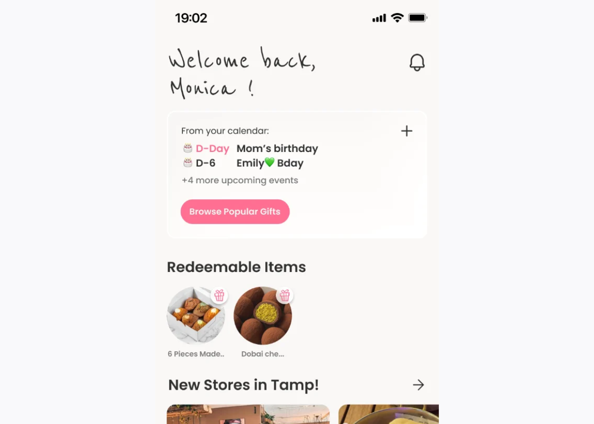
The home screen before and after the calendar block. The left version was built and running; the calendar was added afterwards. The data was already there, it just wasn't anywhere near the gift.
A bridge, not a calendar app
The card's job is to convert a date into intent, so it holds a countdown, the occasion and one way out and nothing else.
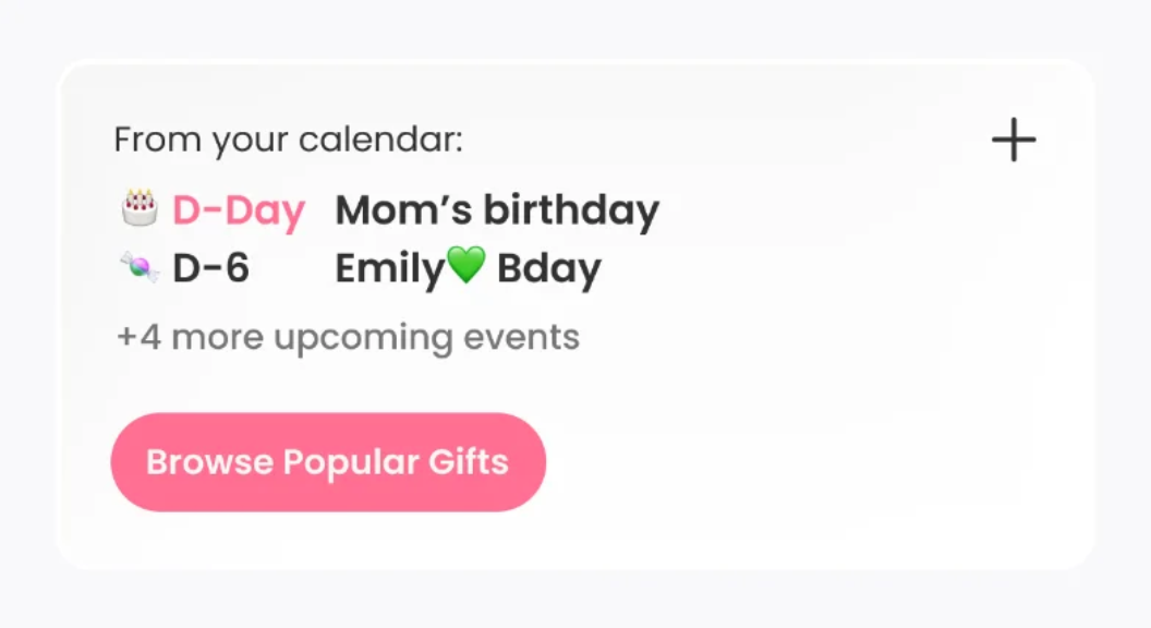
A calendar app helps you manage dates. This card only has to move one date into a decision, so everything else is gone. No month view, no editing, no reminders to configure. Two dates, a count, and a single tap that lands on the gift list. The first version didn't work this way.
One action, not a search
The old card read like a calendar. Two full sentences, then one button: Add Event. Nothing on it led toward a gift. The new one leads with a scannable D-Day, moves the event name into the primary read, and gives the main button to gifting. Adding an event is still there, as the + in the corner.


Trade-off: Adding an event dropped from a button to a small icon, so fewer people may enter dates by hand. I took that because sync already brings most dates in, and the card's job is to move a date toward a gift, not to collect more of them.
Four steps, one intent
Four screens from a date to a sent gift. Everything after the card narrows rather than opens.
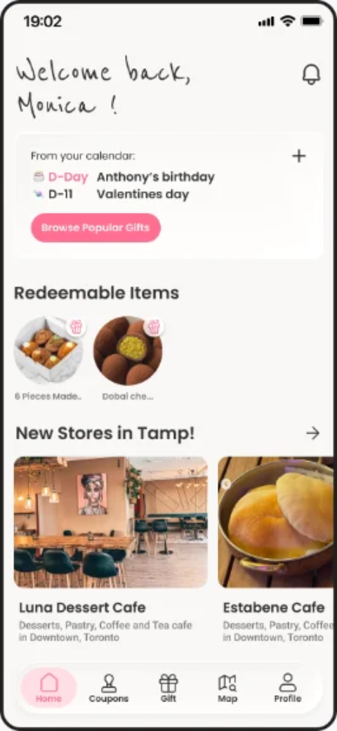
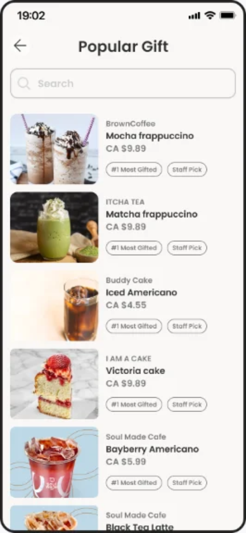
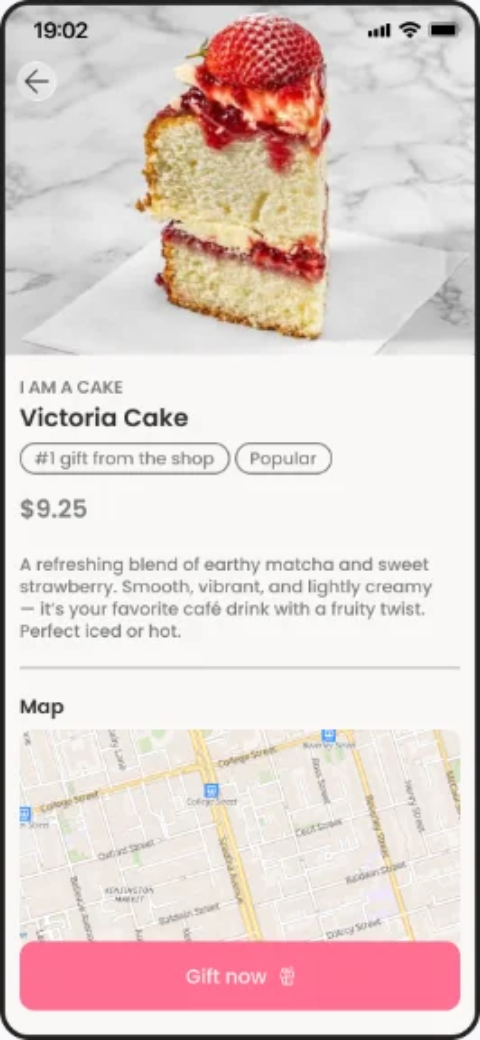
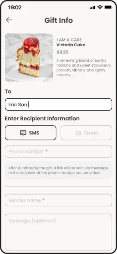
Popular picks and staff picks do the narrowing, so the decision starts from what people actually send rather than a blank search. Search is still there for people who already know what they want.
The send screen hands off to the other half of the app. The recipient gets a link, finds it waiting in Redeemable Items, and uses the map to redeem it in store.
None of this is validated yet. The signals I'd watch first: events opened three days ahead, taps from the card to completed sends, and sessions that end without a selection.
A foundation
Colour, type and spacing defined from the atomic level up, so the decisions above hold across screens rather than one at a time.


